A report is a letter-size PDF with your branding on every page. A report on an MLS market has up to eight pages; a report on a national market has six. This page names each part in page order. For what each number means, see MLS statistics and National statistics.
On every page
Your branding
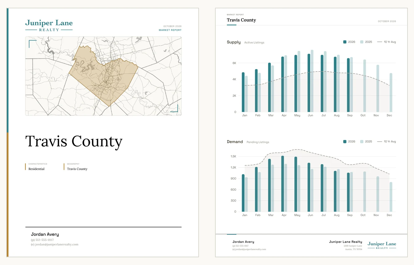
The cover carries your logo at the top, and your name and contact lines at the bottom, with your headshot if you have added one. Every other page has a header with MARKET REPORT and the report’s name, and a footer with your name and contact lines on the left, beside your headshot if you have one, and your brokerage’s name, address and logo on the right. Your two colors run through the charts and accents. To change any of it, see Customize your report.

The date
The month and year at the top of each page, such as OCTOBER 2026, are when the report was made.

An MLS report
Cover
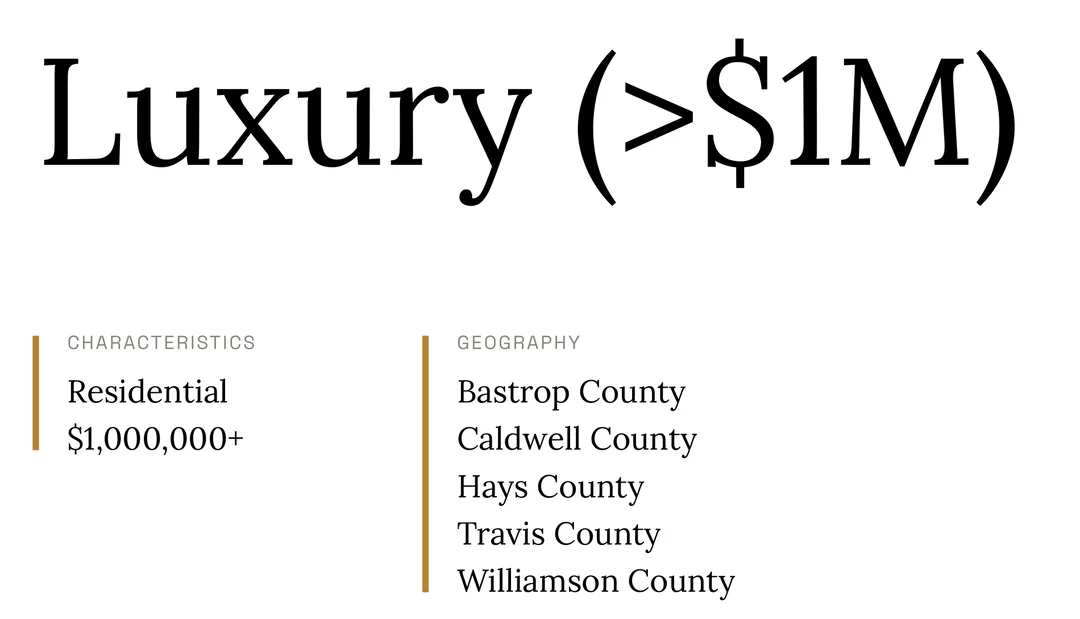
Your logo, the date and MARKET REPORT, a map of the market’s area, and the report’s name. Under the name, CHARACTERISTICS lists the kind of home and any price limit, such as Residential and $1,000,000+, and GEOGRAPHY lists the places the market covers.
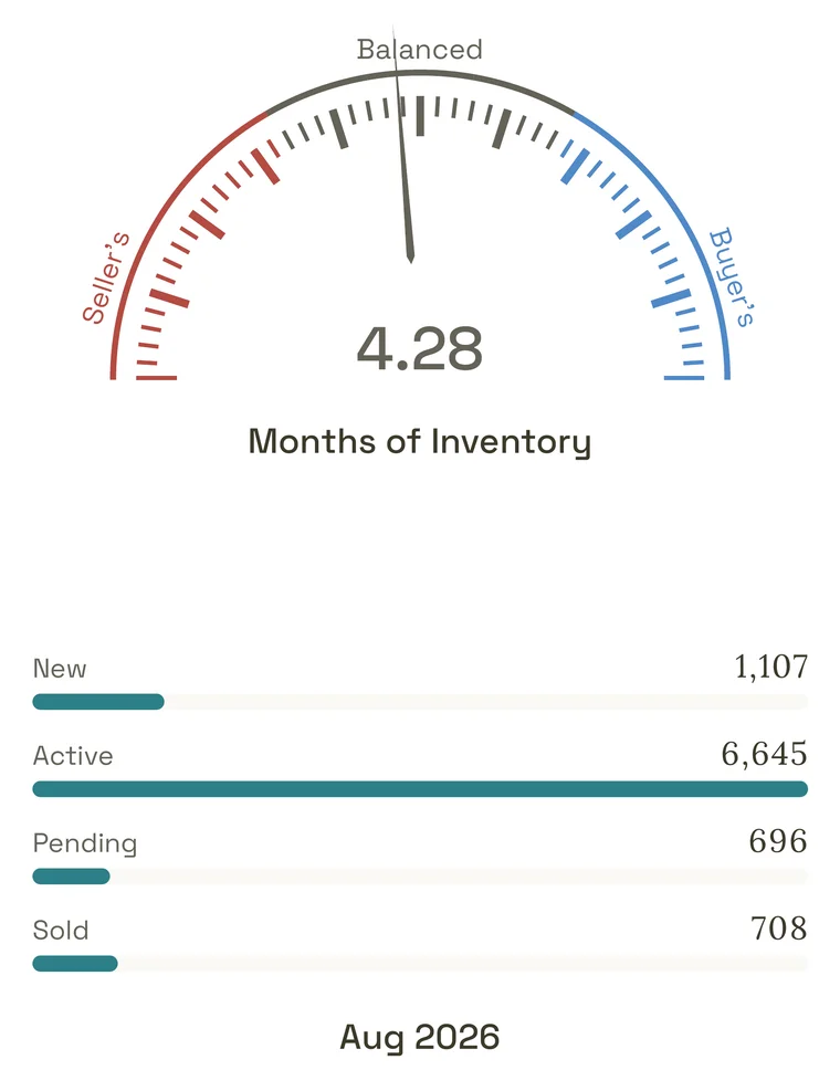
Months of Inventory and listing counts
The gauge shows the market’s Months of Inventory, from Seller’s through Balanced to Buyer’s. Below it, a bar for each status counts the market’s listings: Active, New, Reduced, Pending, Sold, Withdrawn, Canceled and Expired. The period they cover, such as September 2026, is printed under the bars. A status with nothing to count is left out.
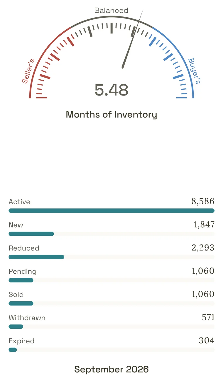
Unless you chose a longer period above the counts on the market’s page, they cover the last complete calendar month before the report was made. A market’s page can end a month earlier until something in that market changes in your MLS this month, so early in a month a report’s counts can be a month newer than the page’s. See Which months each period covers.
Active counts every listing that was active at any time in the period: see All Active Listings.
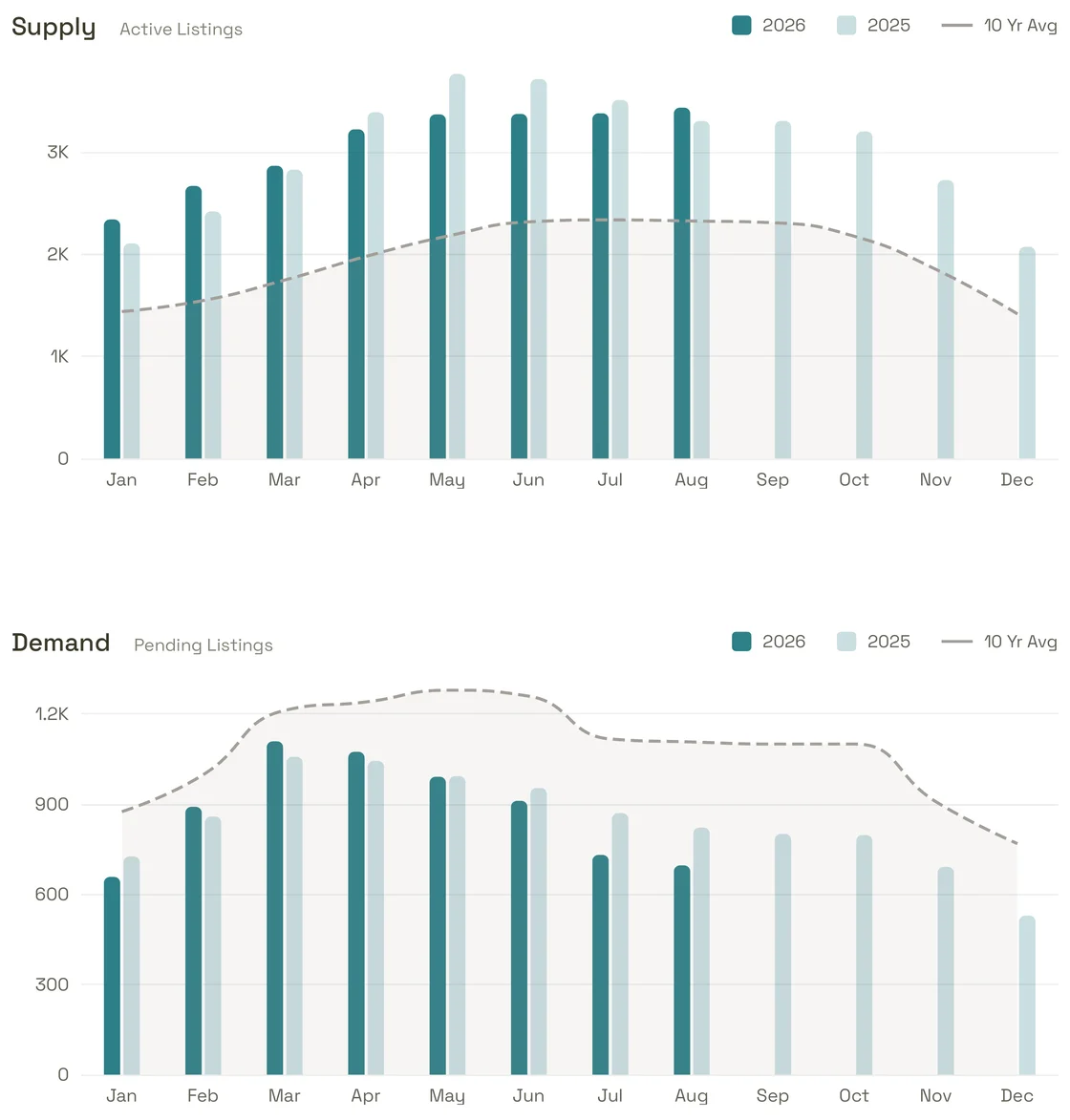
Supply and Demand
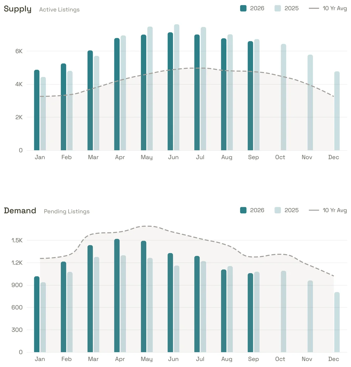
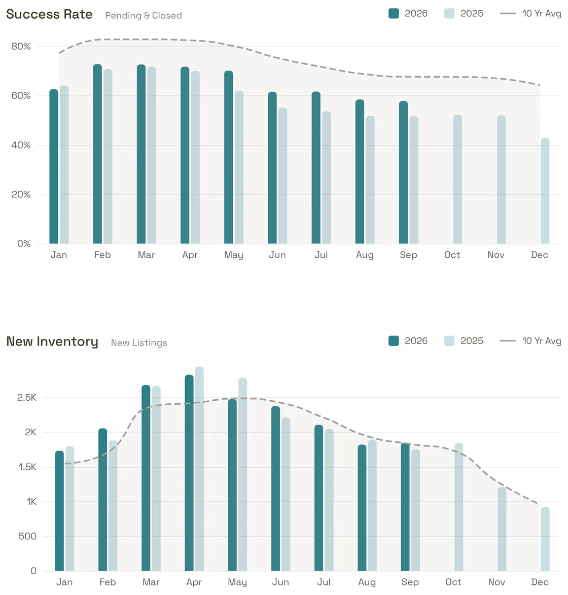
Supply (Active Listings) and Demand (Pending Listings), month by month. Dark bars are this year and light bars last year; the dashed line is the average for that month over the years in its label, such as 10 Yr Avg.
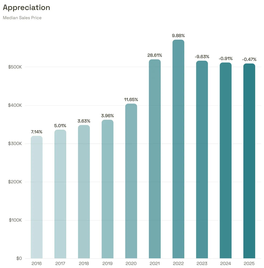
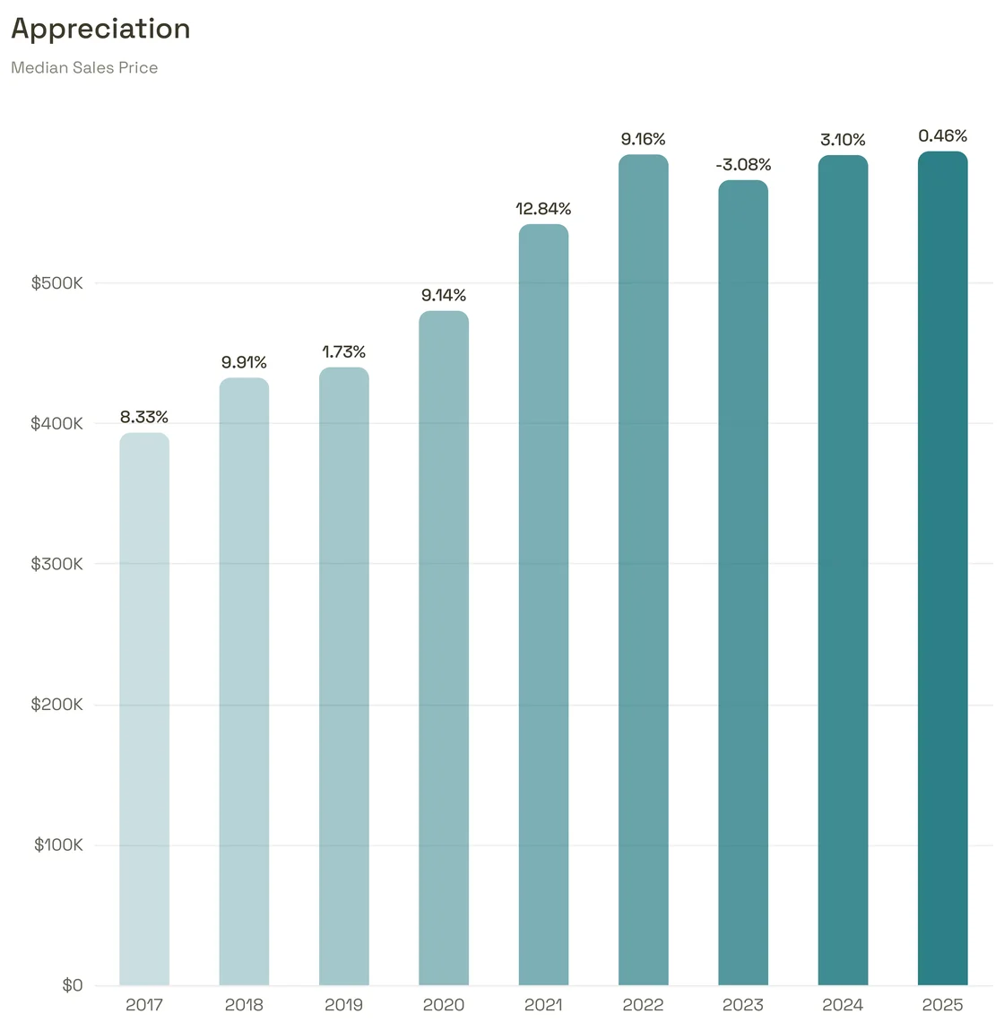
Appreciation
The Median Sales Price for each of up to ten complete years, with the change from the year before above each bar. A market with a price limit, such as one for homes over $1 million, has no Appreciation page, so its report has seven pages.
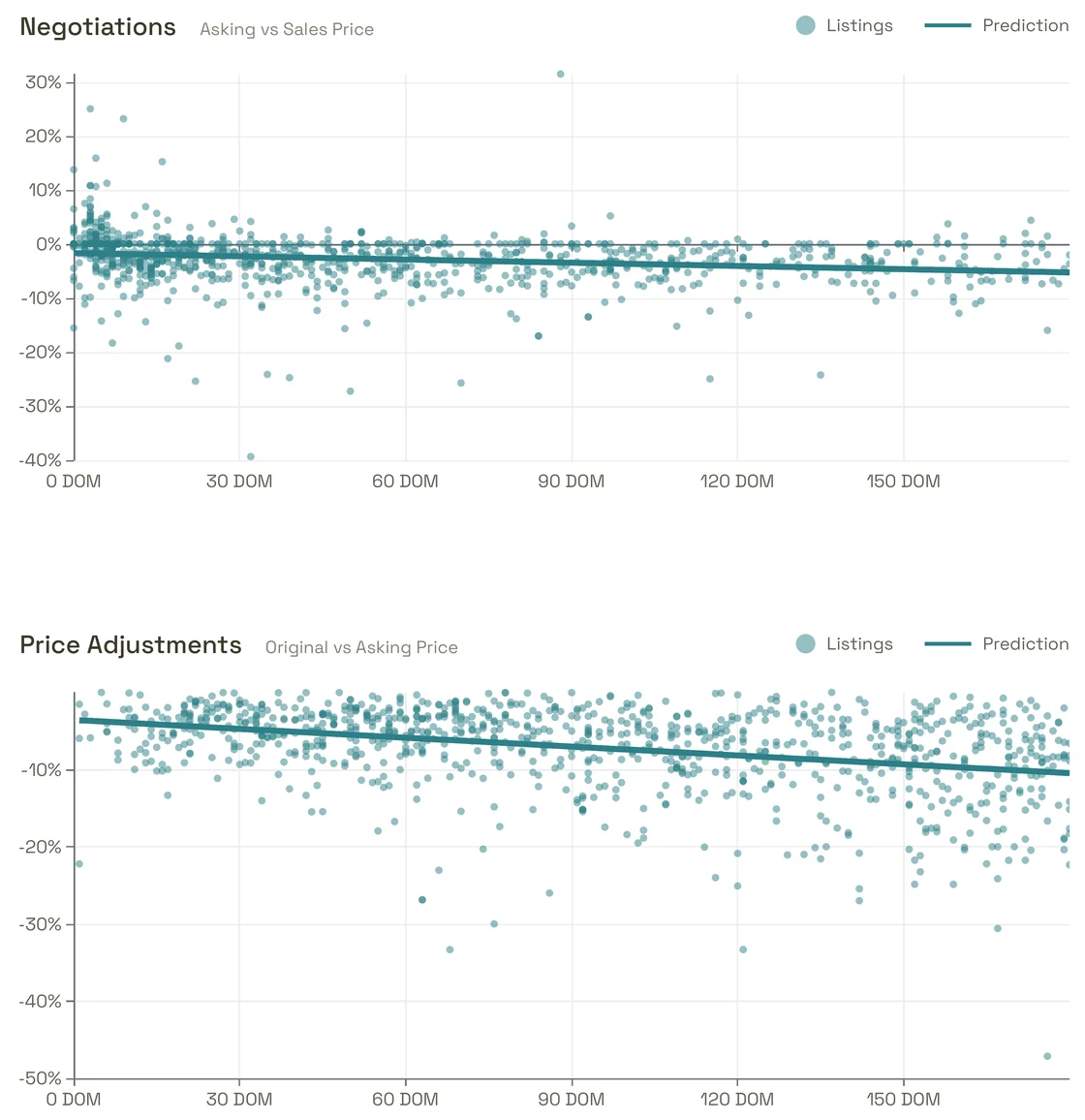
Negotiations and Price Adjustments
Each dot is one home from the last 12 months, placed by its days on market along the bottom. Negotiations shows how far each sale landed from its final asking price (Asking vs Sales Price); Price Adjustments shows how far each listing’s price came down from its original price (Original vs Asking Price). The Prediction line is the trend through the dots. No addresses are printed.
Success Rate and New Inventory
Success Rate and New Inventory, month by month, read the same way as Supply and Demand. See Success Rate and New Listings.
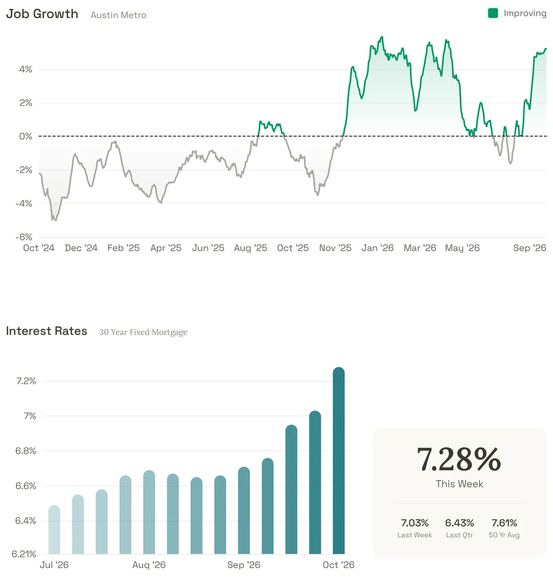
Job Growth and Interest Rates
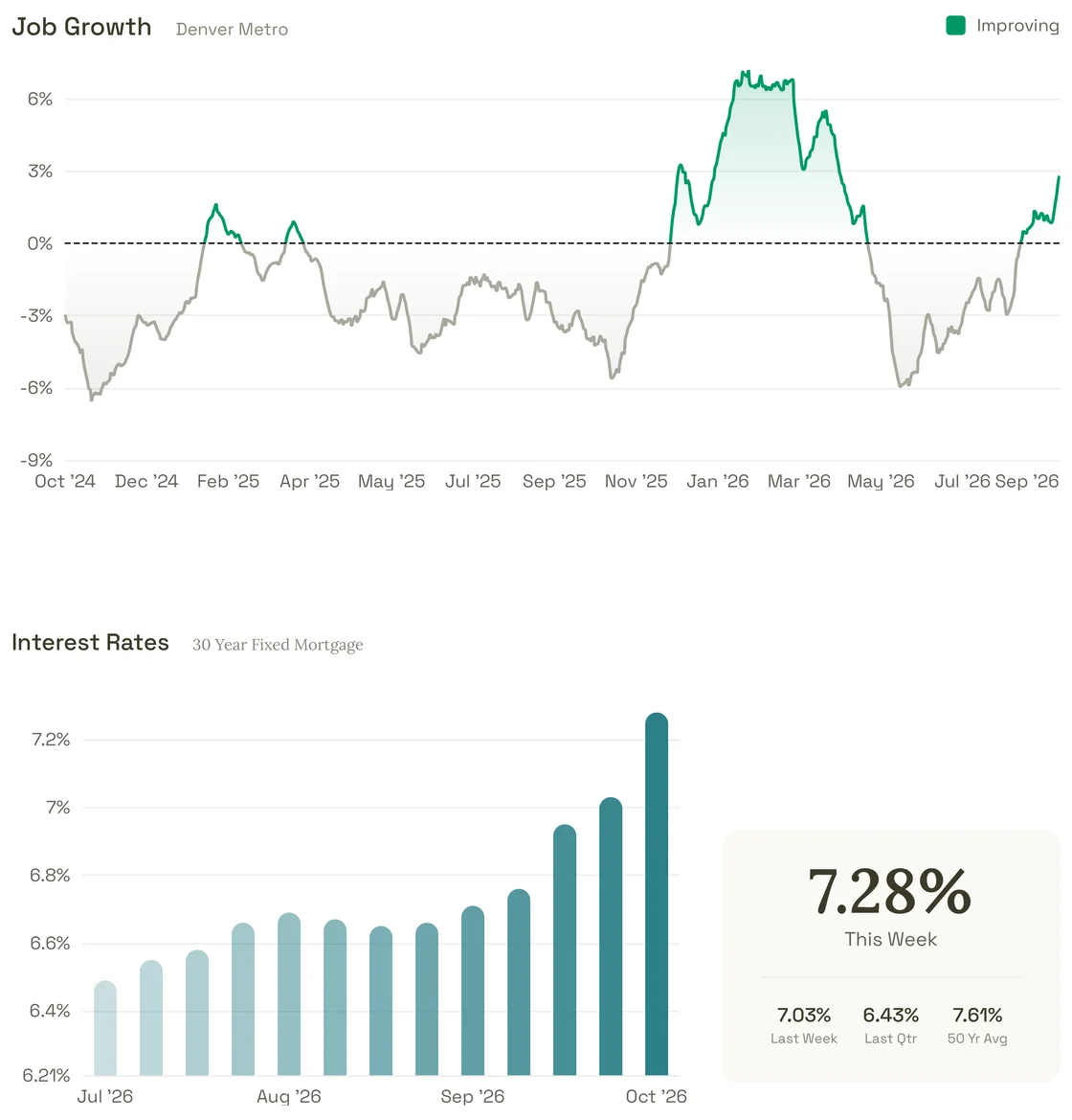
Job Growth shows how the number of job postings compares with 90 days earlier, over the last two years, for the area named beside the title, such as Austin Metro. Interest Rates shows the national 30-year fixed mortgage rate week by week, with This Week, Last Week, Last Qtr and 50 Yr Avg beside it. Where both come from is in Where the data comes from.
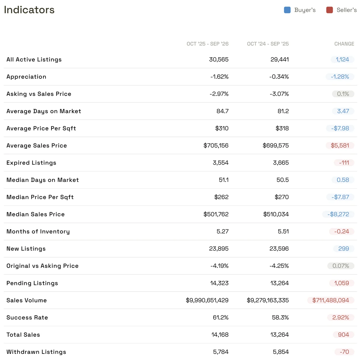
Indicators
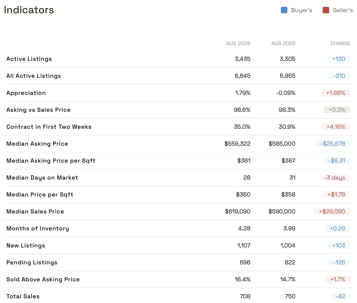
A table of the market’s MLS statistics for two periods, named in the column headings, such as OCT '25 - SEP '26 and OCT '24 - SEP '25, with the difference under CHANGE. A colored change shows which side it favors, Buyer’s or Seller’s, as the legend above the table shows.
A national report
A report on a national market uses national statistics and has six pages:
Cover. CHARACTERISTICS names the property type, such as All Residential or Condo/Co-op, and GEOGRAPHY names the place.

Months of Inventory and listing counts for New, Active, Pending and Sold.
Supply and Demand.
Appreciation.
Job Growth and Interest Rates.
Indicators, comparing two periods such as AUG 2026 and AUG 2025.
There are no Negotiations, Price Adjustments, Success Rate or New Inventory pages. Why the figures can differ from an MLS report on the same place is in MLS and national data.
Good to know
- A report is a snapshot. It keeps the figures and the branding it was made with. For newer figures, generate a new report.
- The pages are fixed. You can’t add, remove or reorder pages; the Appreciation page drops out on its own for a market with a price limit.
- To send a report to a client or save the PDF, see Share or download a report.