A market page shows one market from top to bottom: where it is, how much is for sale, what is selling, how prices have moved, and a table that compares two periods. This page follows it in that order. For what each statistic means, see MLS statistics and National statistics.
The sections fill in one after another as the page loads. A market opened for the first time can show calculating over a chart while its numbers are worked out.
The top of the page
The heading names the market. The button under it describes the version you are looking at, such as Residential. Select it to switch to another version; see Compare periods and property types.

At the top right, the star adds the market to STARRED in the left menu, and customize changes what the market includes; see Edit or delete a custom market. Markets at the top left takes you back to the list.

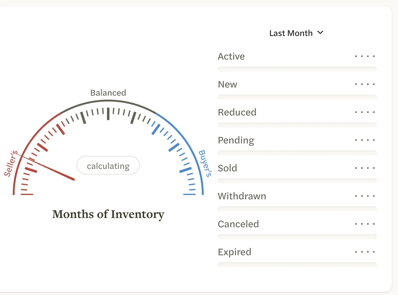
The map
The map outlines the market’s area. The labels over it say what the market includes: on the left, the kind of home, such as TYPE and any PRICE limit; on the right, the area, such as CITY or COUNTY.
Months of Inventory
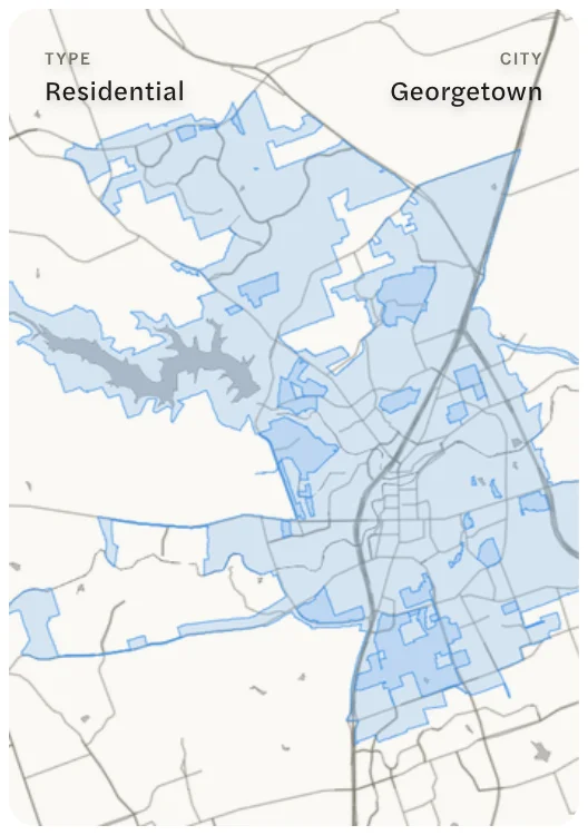
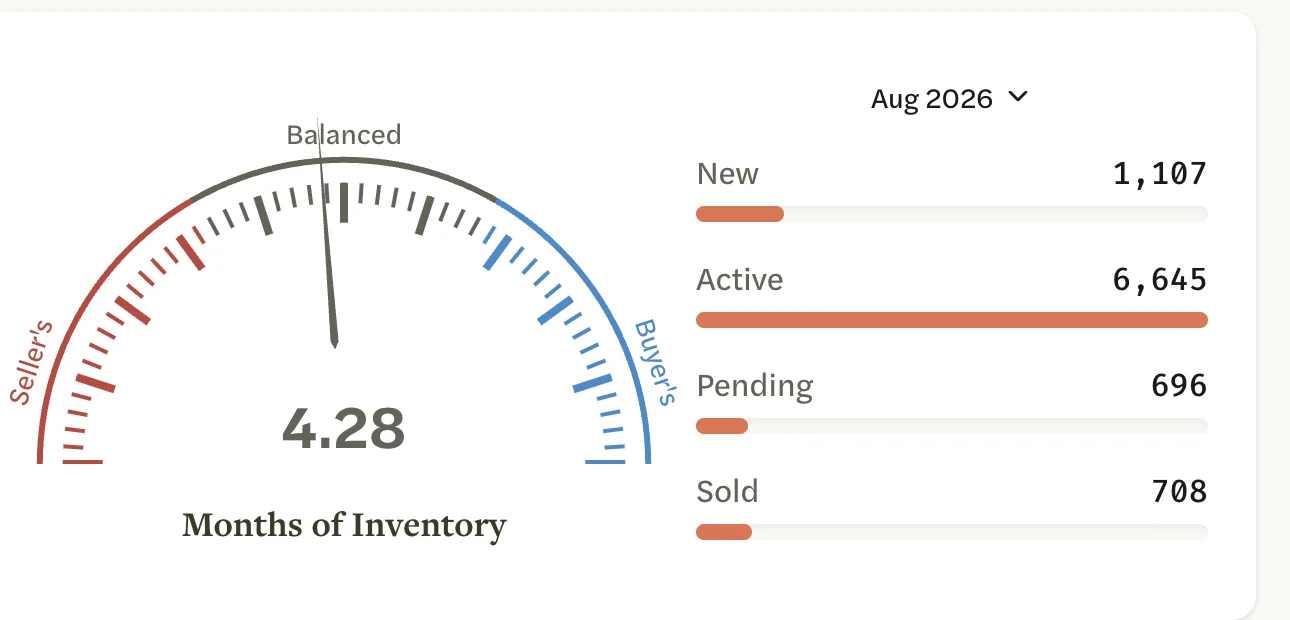
The gauge shows the market’s Months of Inventory for the latest complete month: how long the homes for sale would last at the recent pace of sales. The dial runs from 0 to 9. Under 3 is marked Seller’s, 3 to 6 Balanced, and over 6 Buyer’s. See Months of Inventory.
Listing counts
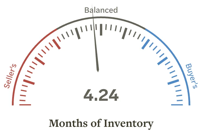
Beside the gauge, a bar for each status counts the market’s listings in one period: Active, New, Reduced, Pending, Sold, Withdrawn, Canceled and Expired. The button above the bars names the period. A status with nothing to count is left out.
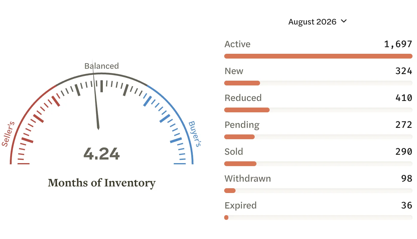
Active here counts every listing that was active at any time in the period (All Active Listings), so it is higher than the Supply chart below, which counts the listings still active on the last day of each month. Reduced counts listings whose most recent price change fell in the period and left them below their original price (Price Reductions).
Supply and Demand
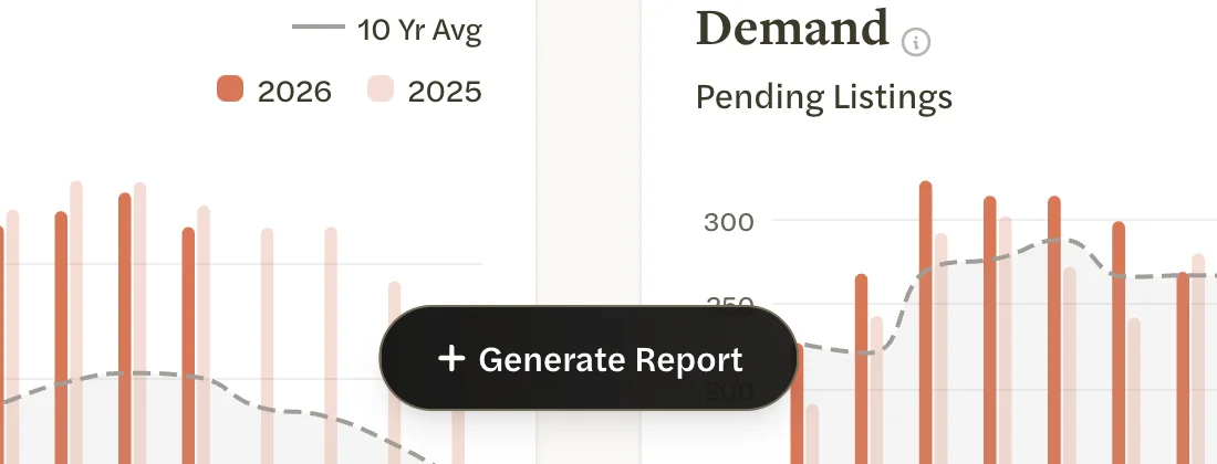
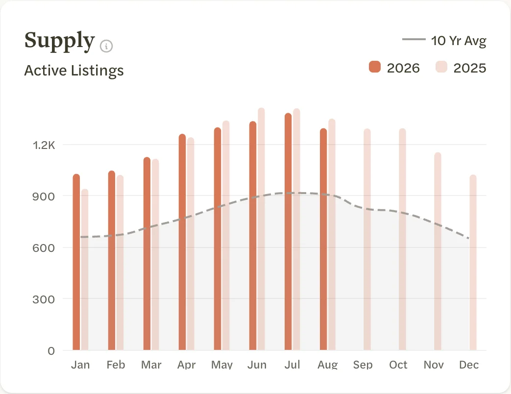
These two charts compare this year with last year, month by month:
- Supply: listings active on the last day of each month.
- Demand: listings that went under contract each month.
The dark bars are this year and the light bars last year. The dashed line is that month’s average over the years in its label, such as 10 Yr Avg; a market with less history shows fewer years. Point to a month to see its figure for every year, and the average.
Appreciation
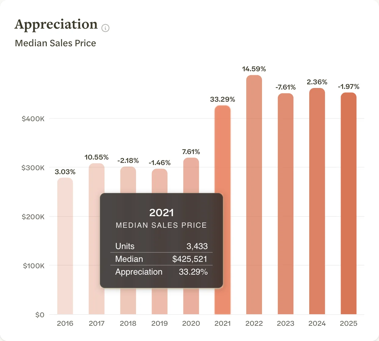
The median sales price for each of up to ten complete calendar years, with the change from the year before above each bar. The current year appears once it is over. Point to a bar to see that year’s Units (homes sold), Median and Appreciation.
A market limited by price, such as one for homes over $1 million, has no Appreciation chart.
Negotiations and Price Adjustments
Each dot is one home, placed by its days on market along the bottom:
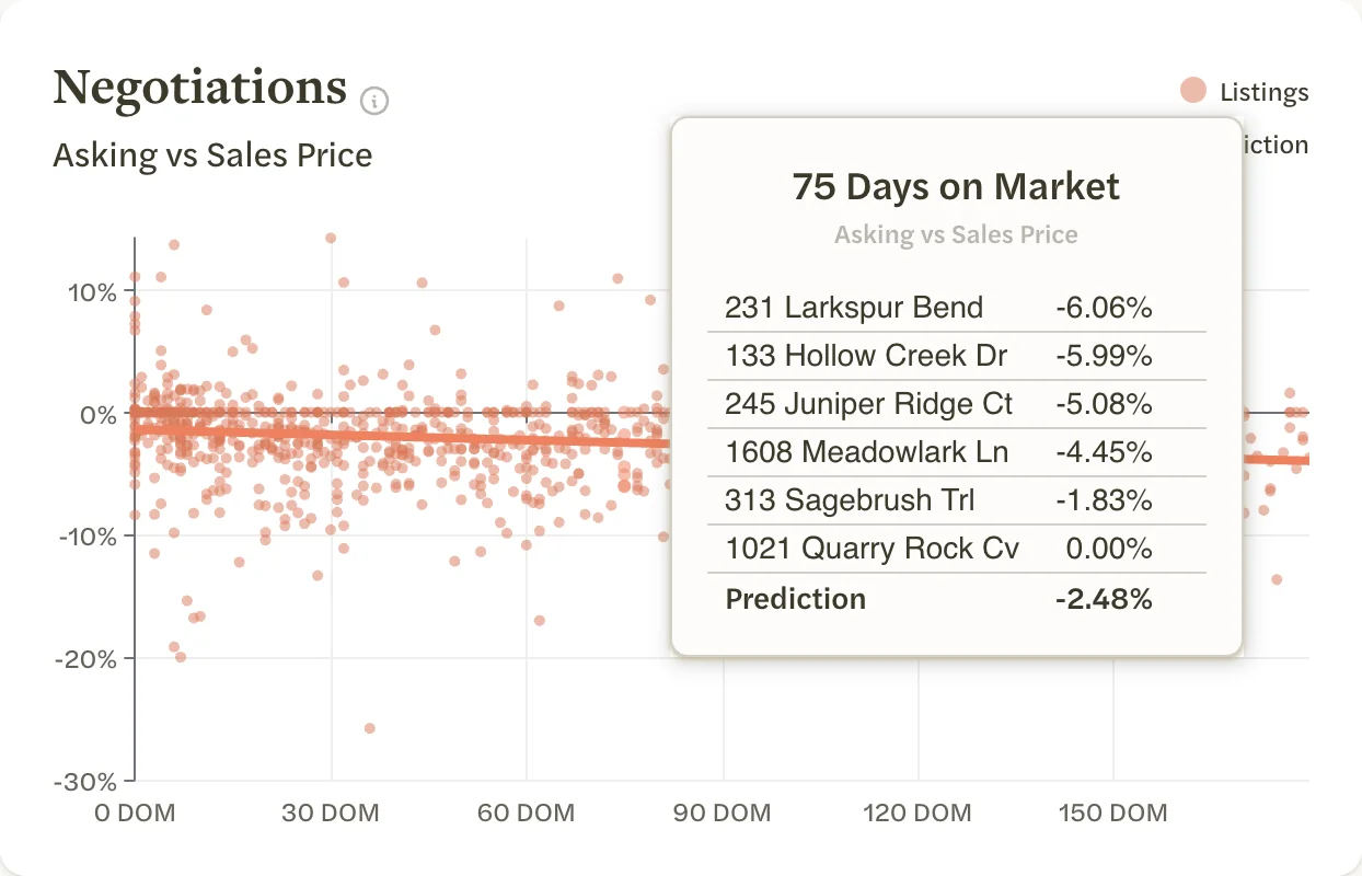
- Negotiations shows homes that sold in the last 12 months, up to 1,000 of them chosen at random. A dot below zero sold for less than its final asking price, and a dot above zero for more. See Asking vs Sales Price.
- Price Adjustments shows listings from the last 12 months that cut their price. The lower the dot, the bigger the cut from the original price. See Original vs Asking Price.
Homes on the market more than 180 days, and price differences of more than 50%, are left out of both. The Prediction line is the trend through the dots.
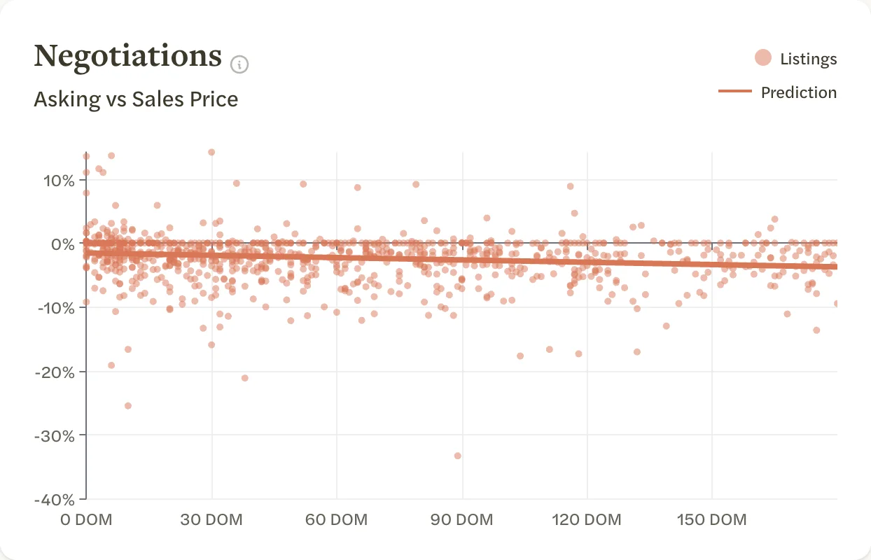
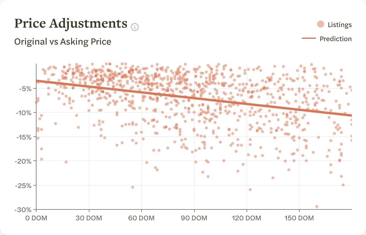
Point to the chart to list the homes at that number of days on market. Select the chart to keep the list open, then select a home to open it in a new tab. Select the chart again to close the list.
Success Rate and New Inventory
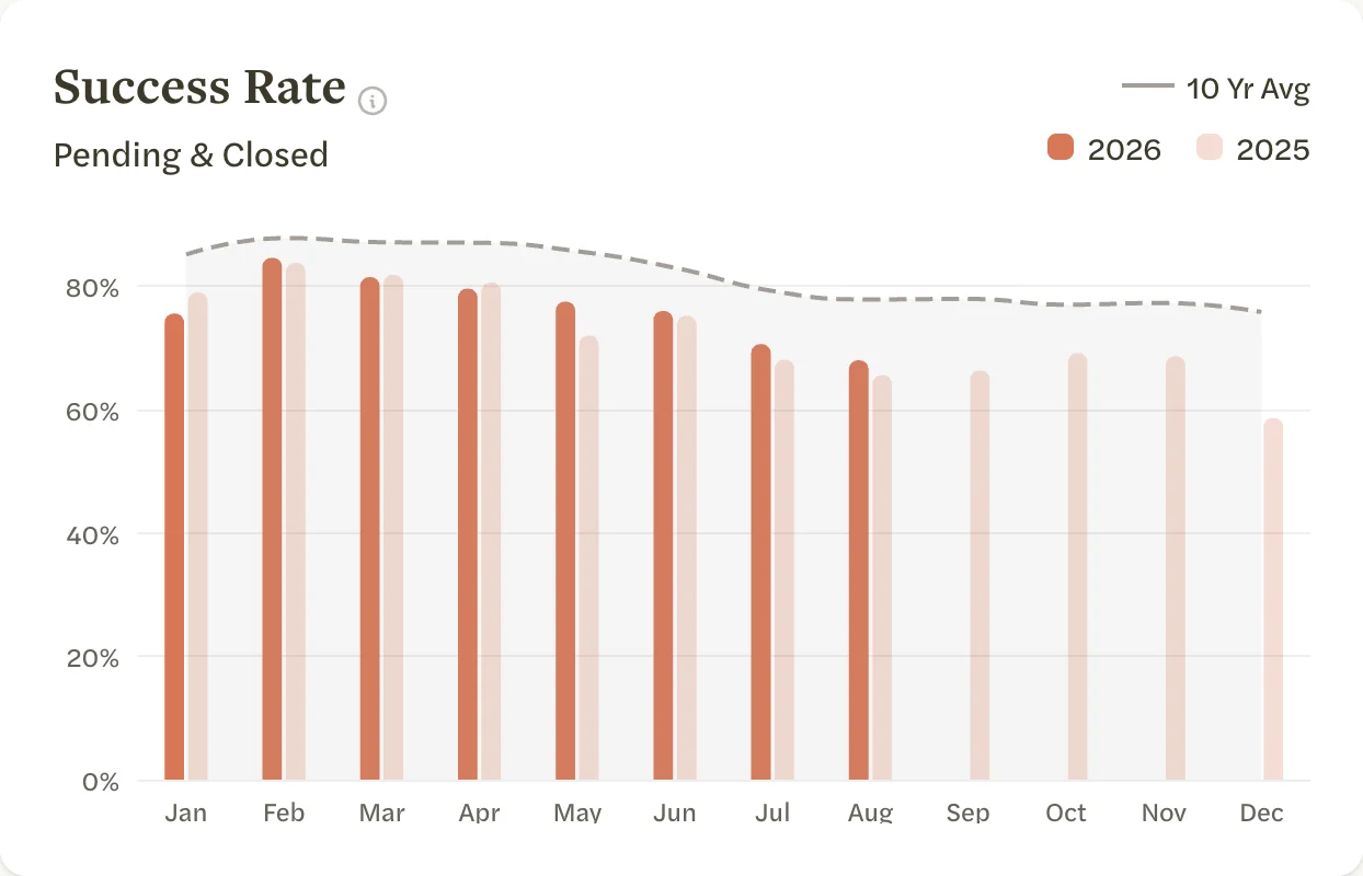
Two more monthly charts, read the same way as Supply and Demand:
- Success Rate: of the listings that left the market each month, the share that went pending or closed.
- New Inventory: listings that came on the market each month.
Job Growth
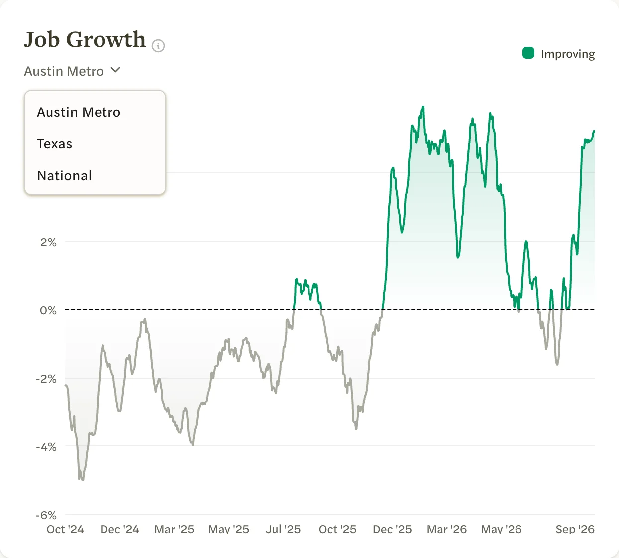
How the number of job postings on Indeed compares with 90 days earlier, over the last two years. Where the line is above zero and green (Improving), there were more postings than 90 days before.
It shows the market’s metro area when there is data for it. Select the area’s name under the title to switch between the metro, the state and the whole country.
Interest Rates
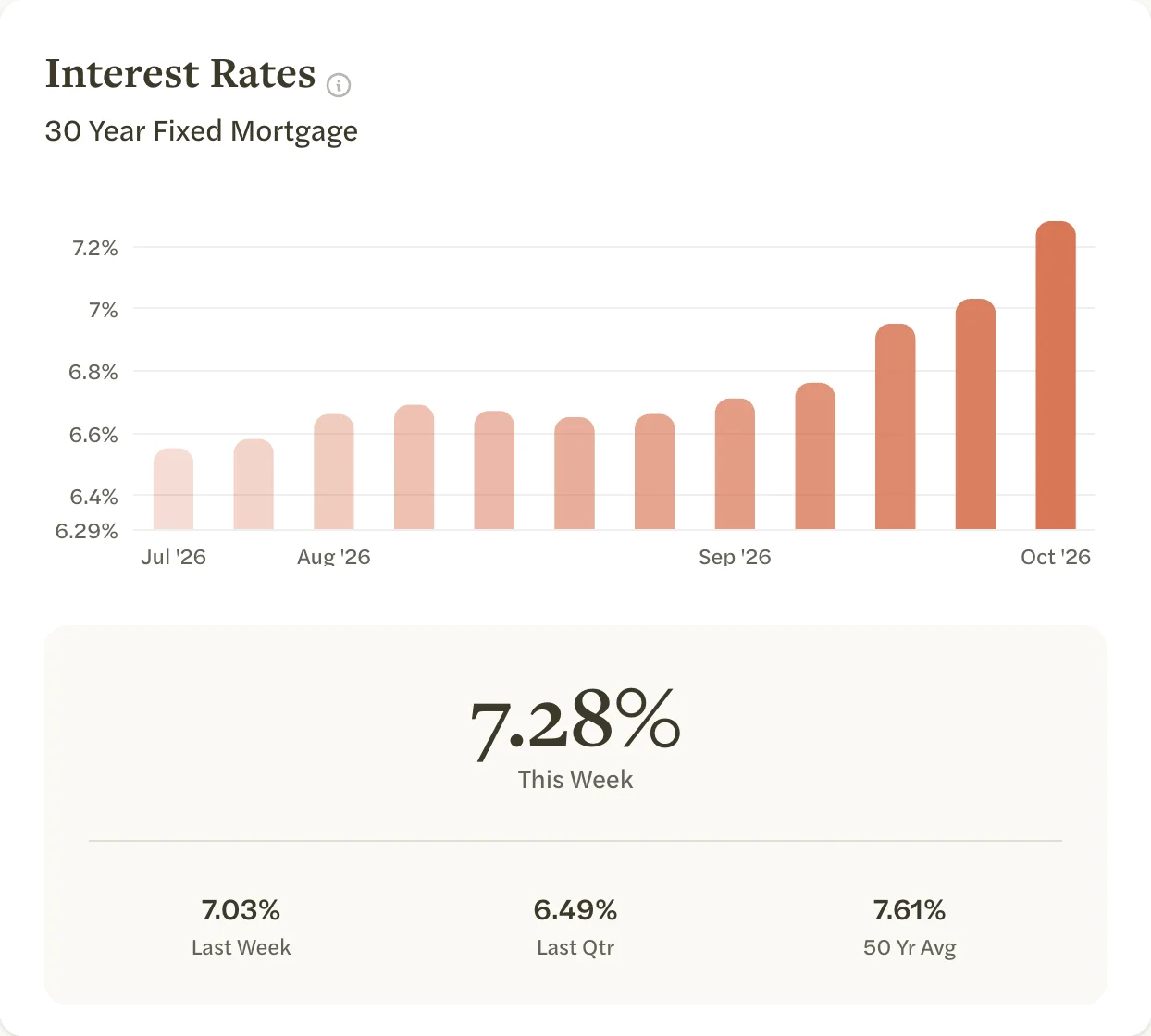
The national average 30-year fixed mortgage rate, week by week, for the last 90 days, with This Week, Last Week, Last Qtr and 50 Yr Avg beside it. It is the same on every market page.
Indicators
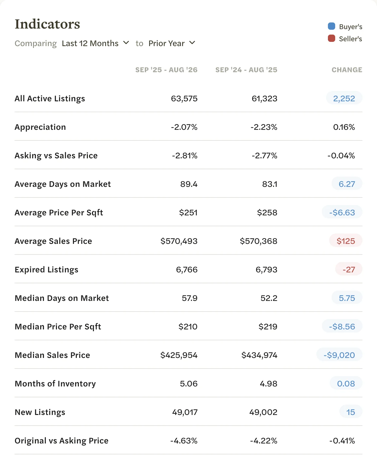
The table at the bottom compares two periods, starting with the last 12 months against the 12 months before. It lists every MLS statistic except Active Listings, which the Supply chart shows, and Price Reductions, which the listing counts show as Reduced. The column headings name the two periods, and CHANGE is the difference. To compare other periods, see Compare periods and property types.
The color of a change shows which side it favors, not whether the number went up or down: blue for Buyer’s and red for Seller’s. A rise in Median Sales Price, for example, is red. Changes in percentages of less than half a point are left uncolored. A statistic with nothing to show in either period is left out.
National markets
A national market, one listed under U.S. Markets, uses data from Redfin and has a shorter page:
- The listing counts are New, Active, Pending and Sold.
- There are no Negotiations, Price Adjustments, Success Rate or New Inventory charts, and no customize button.
- Indicators lists the national statistics and starts with last month against the same month a year earlier.
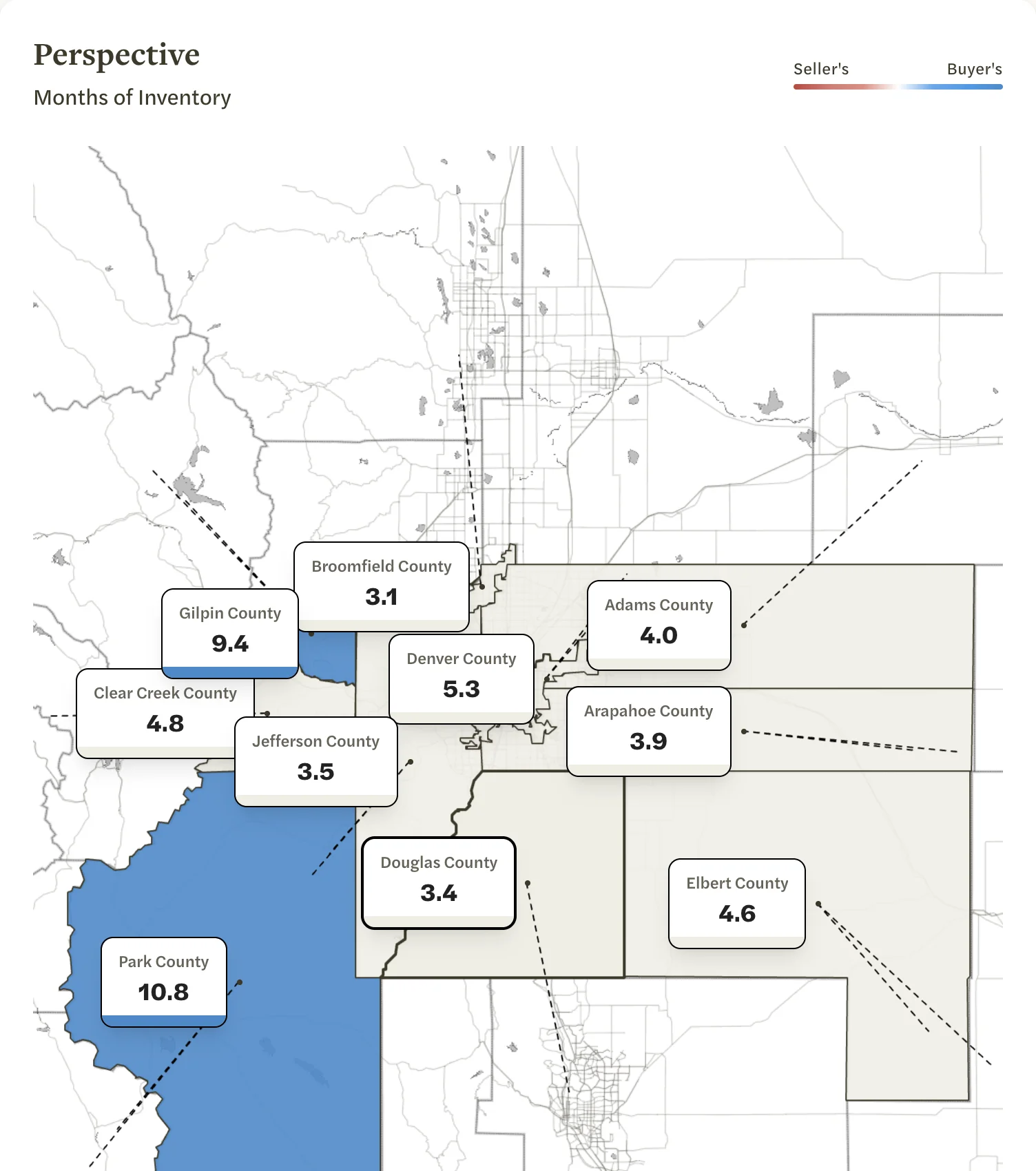
- Perspective, at the bottom, maps the areas in and around the market, each labeled with its Months of Inventory and colored from Seller’s (red) to Buyer’s (blue). Select an area to open it.
Sharing what you see
You can’t download a single chart. To share a market’s numbers, select Generate Report, which floats at the bottom of the screen, to make a report of the market and version you are looking at; see Generate a report. You can also turn them into a social post.